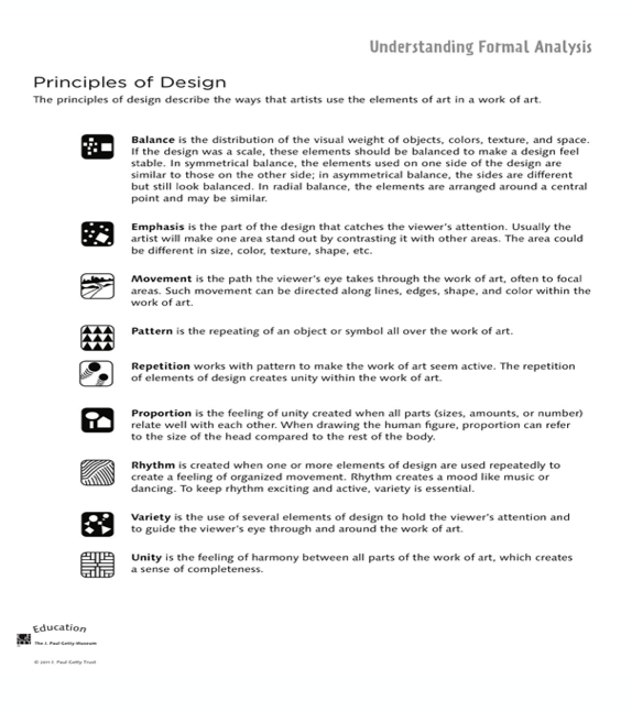
The principles of design are the organization of the building blocks of design. They are the way in which artists use the elements of design in their work. There are 9 principles of design.
Some Definitions!
- Balance: The distribution of the visual weight of objects, textures, colours, and space.
- Emphasis: The part of the design that catches the viewers eye.
- Movement: The path the viewer’s eye takes through the work of art.
- Pattern: The repeating of an object or symbol all over the work of art.
- Repetition: Works with pattern to make the work of art seem active.
- Proportion: The feeling of unity when all parts of the art work well together.
- Rhythm: Created when one or more elements of design are used repeatedly to create a feeling of organized movement.
- Variety: The use of several elements of design to hold the viewer’s attention and guide the viewer’s eye.
- Unity: The feeling of harmony between all parts of the art.
*All definitions are from the principles of design cover page.
My Artwork
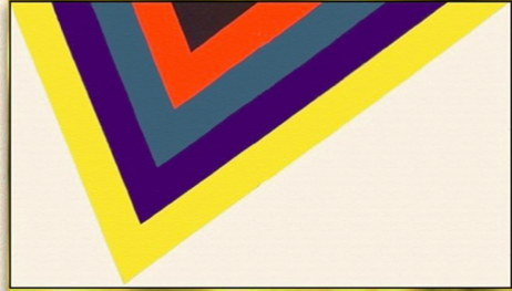
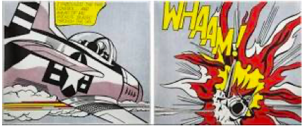
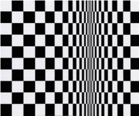
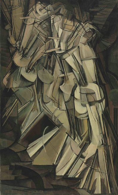
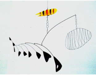
To practice the principles of design, we did a discovery activity focusing on the principle of movement. We were tasked to look at the following 6 images and pick which area of the art demonstrated movement. We then used that area of the art as inspiration to add to our own artwork to show movement.
Instructions for movement activity: Use a pencil and ruler to divide your paper into 6 equal sections. Look at each of the images and see how they move your eye. Do not try and copy the entire image, but only include the part that shows movement the most to you. Write down the title of the artwork/ the artist in each box as well.
Materials:
- Paper
- Pencil
- Ruler
- Eraser
- Materials to add colour, if desired (i.e., markers, pencil crayons)
- Black sharpie to outline images, if desired

I had a lot of fun with this week’s art task! At first, I was a bit confused with how to find movement in the artwork. However, once I got started, it was much easier to see movement in all the pieces!
Critical Analysis
We discussed a few artists that used movement in their artwork. I’ve included them below!

Pablo Picasso
This piece of art is called “Guernica.” It demonstrates movement really well and would be a good critical analysis to get kids thinking about the meaning of the piece as well. I would use this art for a critical analysis for Grade 6/7 and up.
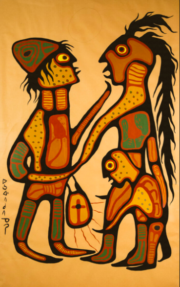
Norval Morrisseau
This piece of art is called “The Gift.” Norval Morrisseau is an Indigenous Canadian artist and he uses his art to share a message. This image focuses on movement, as well as the element of line. I would use this art for a critical analysis for Grade 6/7 and up.

Kent Monkman
Kent Monkman’s art shows an incredible story. This piece of art can teach students about movement, but also about the Indigenous education as well. This piece of art can get students thinking about the emotion and message in the piece. This image can also be used to talk about the element of line, colour, or texture (just to name a few). I would use this image for a critical analysis for Grade 6/7 and up.
Some More Resources!
Here is a unit plan to teach movement and line to a Grade 7 class!
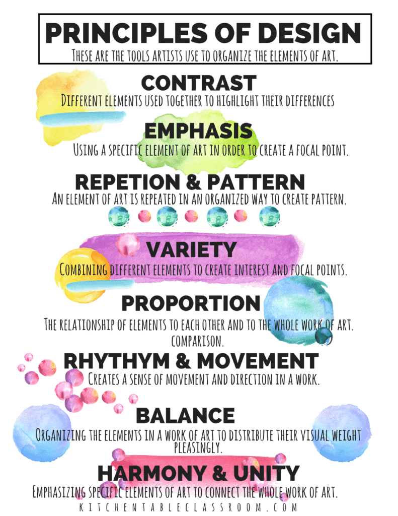
I found this poster that explains each of the principles of design. This could be put up in an art classroom so students can reference the definitions if they forget what the principle means!
I also found this video that explains the principles of design. It is a fairly long video, so I do not think I would share this with students. Instead, I would use this as a resource for myself to further understand each principle of design before I teach it. I really liked the analogy used at the beginning of video to explain the principles of design. It explains that the elements of the design are the ingredients for the recipe, whereas the principles of design are like the instructions that tell you what to do with the ingredients!

Leave a Reply
You must be logged in to post a comment.